
Notice:
This post is older than 5 years – the content might be outdated.
The fact that more and more users are currently using mobile devices to access the internet increases the importance of usability for those appliances. In 2014 about 27.5% website requests around the whole planet were mobile. Google revealed that this year more search requests were made from mobile devices than desktop computers for the first time in the USA and many other parts of the world. That’s why web developers have to shift their focus to the mobile user experience – read on for a detailed analysis of the current situation and its consequences for developers.
The user experience of websites and web applications is more important than ever to create good products with which users can manage their tasks as easily as possible. Still, implementing appropriate GUI components on the front end for an effective and efficient usage is neglected all too often. Developers have to focus on the structure and design of future websites and extend their usability skills.

GUI Elements
A Key difference between desktop and mobile devices is the limited space. This directly impacts on positioning and choosing sizes of GUI elements when porting a website from desktop to mobile. You should always keep the Fat Finger Syndrome in mind – users control the app with their fingers, thus touch elements need to be increased in size.
Also Progressive Disclosure is a strategy you should use wisely
- On first sight, only show the main functions and control elements
- For users who know your app better, put advanced options into menus
A study of GUI components used in the web leads to the following categorization:
- Basic HTML-Tags
- input
- button
- form
- select
- slider
- font
- embedded media
- Navigation
- navigation bar
- search bar
- side menu
- breadcrumb
- pagination
- scrollspy
- Content
- list (e.g. table, accordion, checklist)
- symbol
- gallery
- calendar
- dialog
- i18n (language internationalization)
- Additional information
- popup
- tooltip
- spinner
- badge
These GUI components represent the most commonly used elements on websites. You should always consider which component is most effective for your use case. For mobile views you have to keep best practices in mind and choose the element that promises the best efficiency and effectiveness.
Jennifer Gove presented nice ideas and principles for designing a mobile view at Google I/O 2014:

By loading the video, you agree to YouTube's privacy policy.
Learn more
More and more mobile devices are sold each year. In 2013 more than one billion smartphones (devices with extended system and connection functionality) were sold for the first time. Market analyses show the rising demand for flexible and easy to use tools and devices.
Responsive vs. Adaptive Design
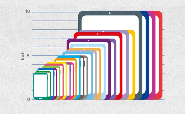
There is an incredible amount of different screen sizes out there. In 2012 OpenSignal started a six month survey to figure out how many different mobile phones are in use. They found 681.900 Android devices in total with 4.000 different phones and 230 different screen sizes. The fact that each manufacturer can create his own screen size and screen resolution leads to an infinite variety of sizes.
So modern websites have to be dynamic to cater to all these different screen sizes. There are basically three ways to achieve this:
- Responsive Design
- Dynamic Deployment
- Separate Website
The most commonly used solution is ‘Responsive Design’, as there is no redundant information. The information of the site is provided only once. Media queries recognize screen dimensions and adjust the view components.
Creating a separate website for mobile devices (Dynamic Deployment) means more effort, because the whole application has to be built multiple times. This approach is only recommended if the app is very complex and provides certain mobile-specific elements.

As you can see in the graphic above there is only one version needed when using Responsive Design. However you need two or more version when using Adaptive Design (one version for each layout). The user agent sends its information to the server to check whether the needed functionality and dynamic is given. Dynamic Deployment and a separate website distinguish between the way of accessing the content. In Dynamic Deployment the user agent decides which version is delivered to the client’s device. With a separate website the developer can create a different domain, so that users can decide which version they want to see through the URL.
Today in most cases it’s definitely the best to create one version and use media queries to rearrange elements for other layouts.
Summary
This was a very short introduction to the usability of mobile views. I hope you got an insight into usability and its complexity.
Provide your website or application to mobile users! Use frameworks like bootstrap that help you creating mobile views. Also start using Flexbox and CSS Grid Layouts to easily structure your HTML/CSS and separate content and style.
To summarize, here are the most important rules you should stick to when creating a mobile optimized website or web application.
Do’s
- Reduce your content to the most important
- Make use of Progressive Disclosure
- Create clear and easy navigation
- Optimize usage of space
- Recognize the Fat Finger Syndrome
- Make the few main actions clearly visible
- Target the audience of your website/web application
- Consider different screen sizes and performance of devices
- Place an ‘intelligent’ search bar on front page, not (hidden) in menus (autocorrect, make suggestions while user is typing etc.)
- Create smart forms where the user knows intuitively what to do (show hints, use labels, correct mistakes or give tips)
- Think about a side menu only if there is content that’s worth mentioning
- Use the Law of proximity to group elements before adding lines (they quickly become visual noise)
- Try to find appropriate symbols for actions because they are recognizable more easily and space is limited
- Icon fonts help your webapp to be more performant (vector icons are scalable, icons can be treated as text)
Dont’s
- Don’t demand a registration before showing content (users want to see what you can offer them before they give their private information)
- Avoid using images to enhance your websites design – only show images if they contain information
- Use modal dialogs only for critical actions (e.g. before deleting something important)
Literature
If you are interested in usability and creating mobile views you should check out the following resources
- Mobile Usability (Jakob Nielsen and Raluca Budiu, 2013)
- 100 Things every Designer needs to know about People (Susan Weinschenk, 2011)
- Principles for web design
- Guidelines for Mobile Web Development
- Tips for mobile website design
Get in touch
Don’t want to get your hands dirty? Our developers have years of experience in developing mobile and web applications. Visit our website for a full portfolio, ask for a quotation at list-blog@inovex.de or call +49 721 619 021-0.
Found this guide useful? Comment and share it using the social buttons below!